The Font
My first font
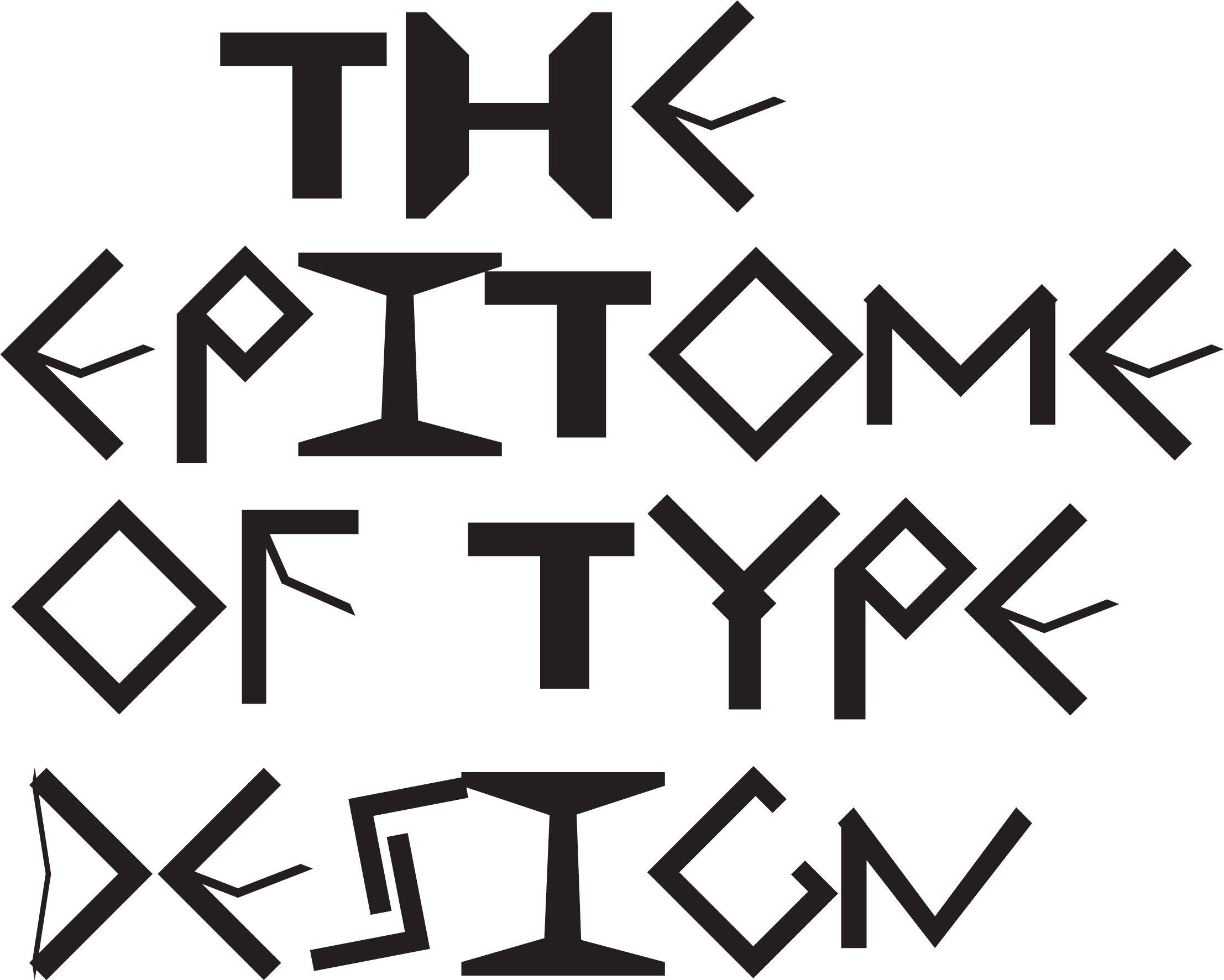
Just the first try at creating a working font, getting the hang of the process from Illustrator to SVG to Fontforge to a font file. Obviously it's no Comic Sans but we all have to start somewhere.
Inspiration
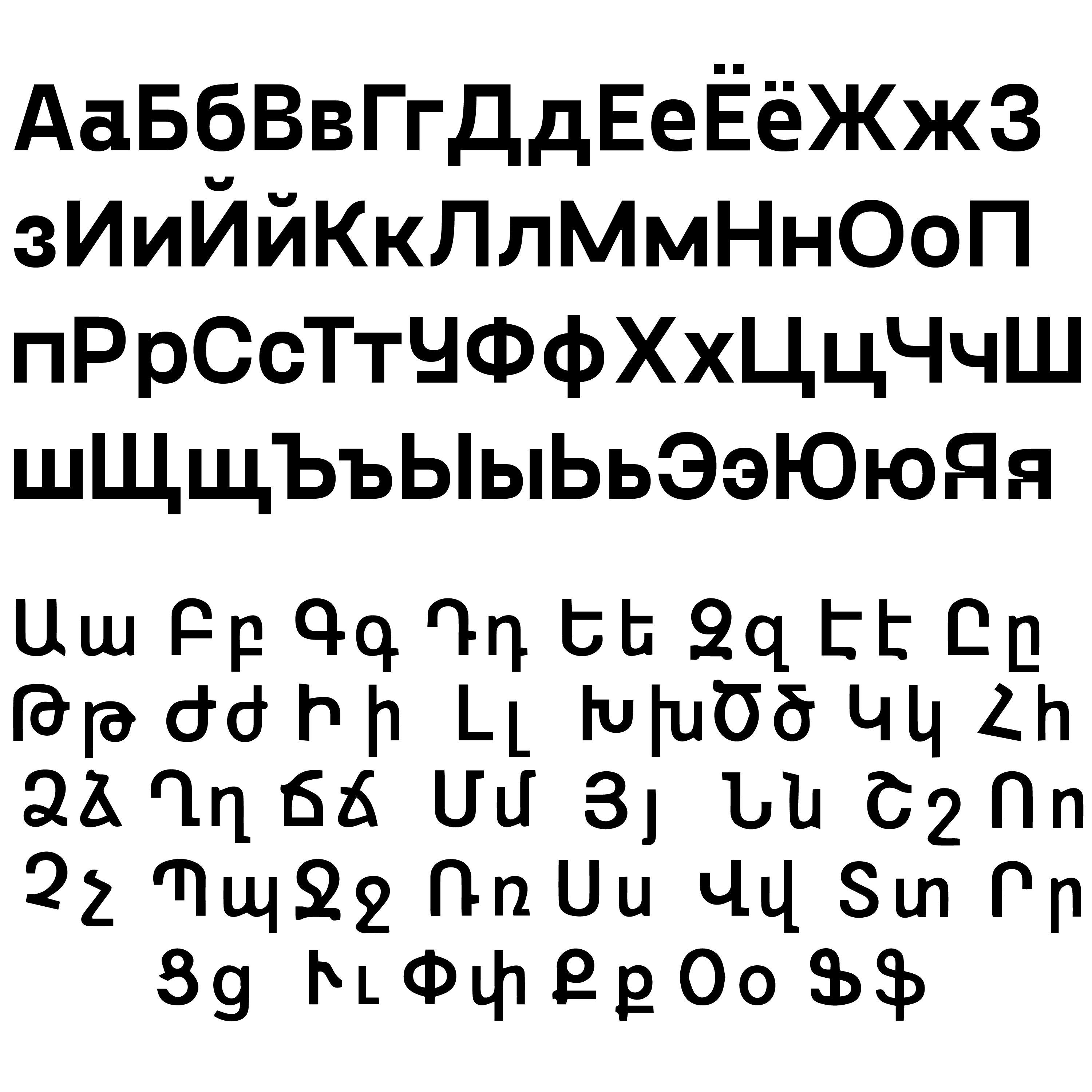
Cyrillic (Gosha Sans) and Armenian scripts
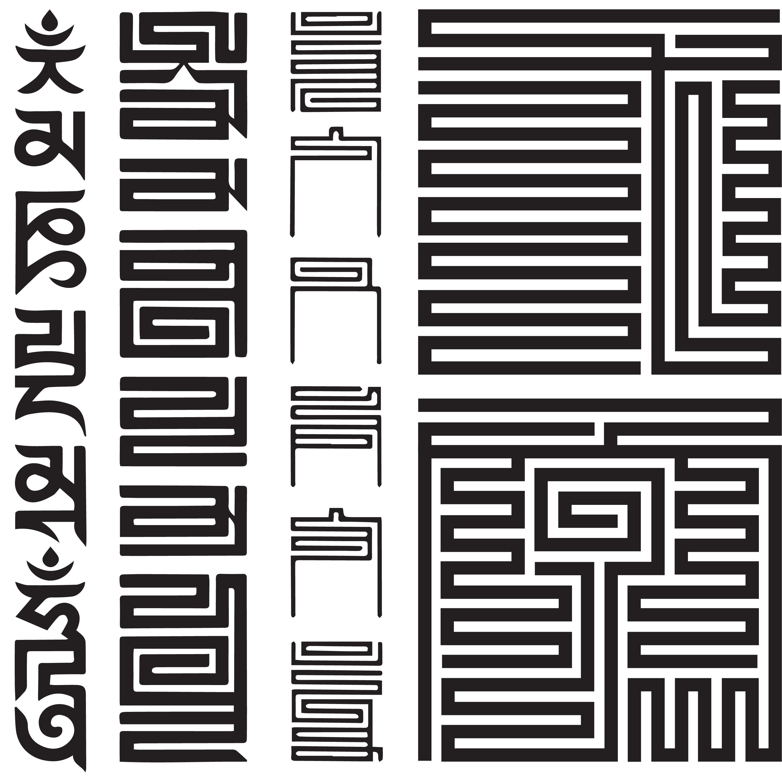
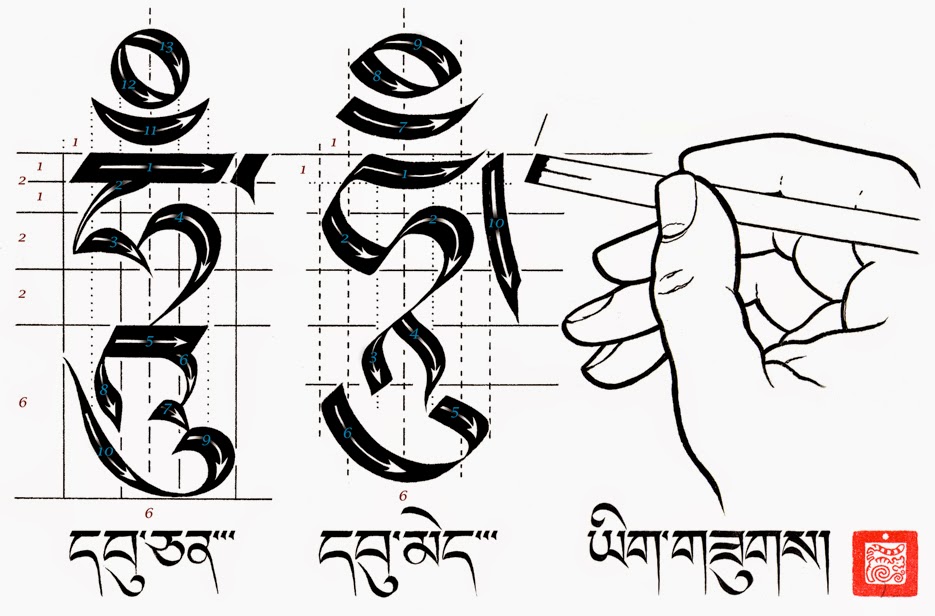
Tibetan/Mongolian scripts and Chinese 9-fold script.
I am a bit of language nerd so I knew I wanted to explore a wide variety of scripts and writing styles from around the world, rather than just the modern latin alphabet. My favourite writing systems all come from the East Asia region, particularly the many different Tibetan and Mongolian scripts as well as Chinese seal script and folded scripts. I also wanted to explore others that I wasn't so familiar with like Cyrillic and Armenian, Georgian and so on.
First 'real' font
This was the first direction I took in designing my font. It is inspired by the Mongolian folded script that I was looking at earlier. I designed it entirely in Adobe Illustrator as the design of the font just suited that workflow. It was imported into Fontforge and exported pretty much as is with a few kerning adjustments. While I did like this direction, I wanted to experiment more with letter design, kerning, variabilty, and other typographic characteristics, so I decided I would change the aesthetic direction. I will later come back to this font and finish designing it so I can use it too.
More ideation
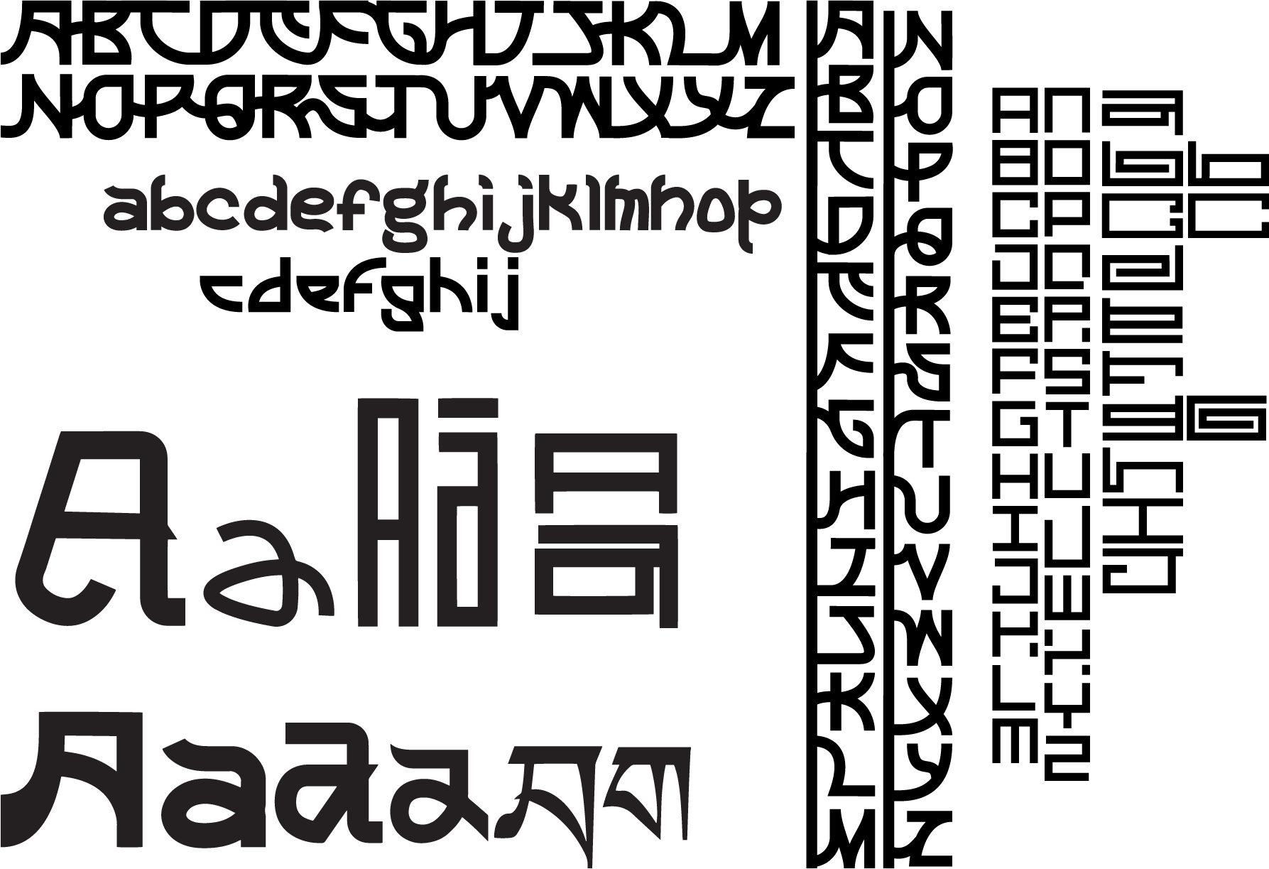
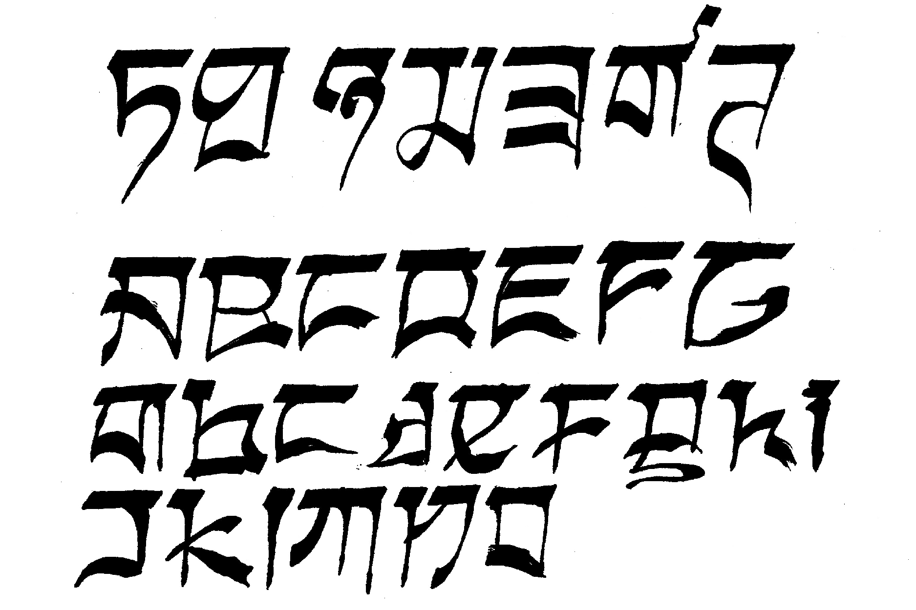
Some of the different directions I took
I went down the path of designing the letters of a number of different fonts. I found myself designing the uppercase letters of a typeface I had in mind, but when it came to designing the lowercase letters it would spawn an entirely new font and I would have to rethink my idea. I decided that I needed to have a set of rules to follow to facilitate the design of a more cohesive typeface, which is when I came across the Tibetan Uchen script, created by Thonmi Sambhota, a 7th century Tibetan scribe and academic.
‘Uchen’ in Tibetan means ‘with a head’, which refers to the design of the script having a bar of the same width and angle at the top of every letter. I started to design some letters using this rule, as well as some of the other design choices present in Uchen script. I also tried my hand at some calligraphy, writing Tibetan characters as well as English letters in the same style. While it’s safe to say calligraphy is not my strong suite, it did help me understand why some of the strokes are shaped the way they are, so I could keep my font true to the original in some way.
All glyphs complete
I went through quite a few iterations of each letter to get the right balance of 'looking Tibetan' but also looking like a part of my font as a whole. This was proving to be particularly hard for the lowercase letters, as I didn't follow the traditional methods of using a base set of letters to design the rest of the letters, I took the approach of keeping each letter quite unique, though using some similar strokes and shapes within them. An important part of the font is the punctuation, I borrowed some of the Tibetan punctuation to use on my font, so rather than commas, periods, hyphens and such being tied to the baseline or middle of the x-height, they correspond to the head of the letters.
Fontification
Being one of the first fonts I have designed, the next part was definitely the most daunting. I had a lot of ideas for my font that hinged on some more technical features in Fontforge, so I had to do a lot of research into those things first. I started off on the simple side with kerning pairs; many of the letters in my font are quite oddly shaped, so the kern pairs that were required were not the usual suspects, and some of the extra spaces were quite severe.
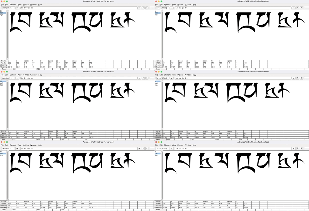
Kerning in Fontforge
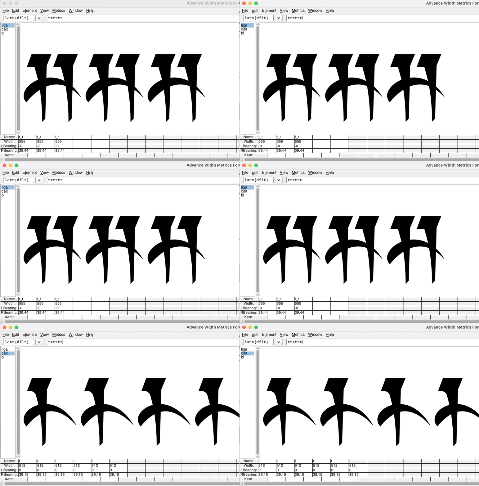
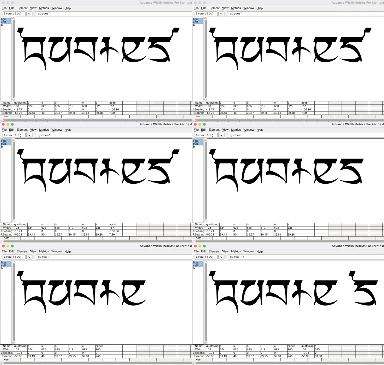
I then went on to the various substitutions that would be present in my font. The first one I did was just a simple ligature, substituting 'tt' for its own glyph. The I went on to the more complex ones; the chaining substitutions. Specifically the one I needed was a contextual chaining substitution to allow the single quote mark to change to left and right quotes. If any letter was followed by a single quote mark, the quote mark would change to a right quote, though if the quote mark was at the start of a word, it would be a left quote mark. This was important in my font as my punctuation is derived from the Tibetan decorative punctuation, particularly the quote marks/apostrophes as they're the only glyphs that ascend above the head of the letters.
Making it variable
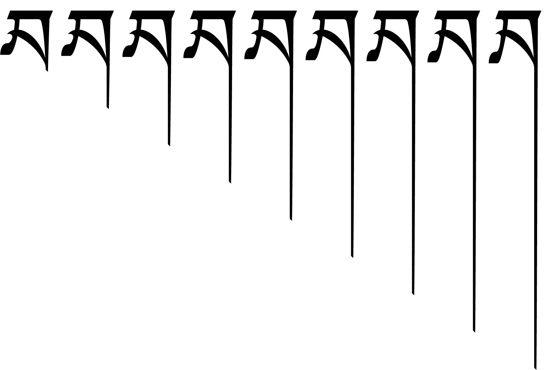
When it came to making my font variable I realised I first had to go back to my font design and alter the design of all the letters so the path points were conducive to variability, then making sure all the descenders were a uniform thickness so I had even ‘drips’.
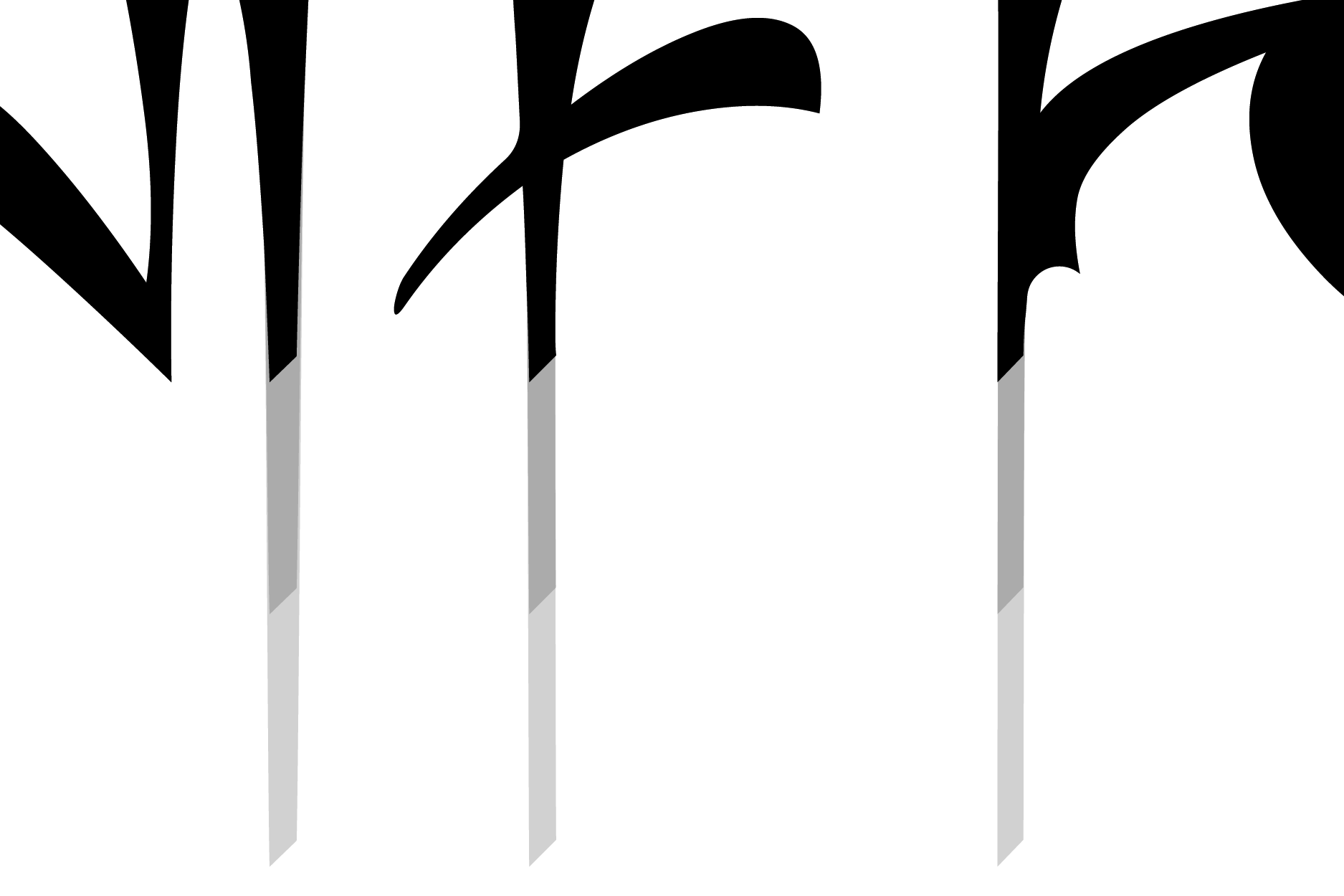
Standardised descender widths and shape
To create the variability I decided to download Glyphs 3, as doing so in Fontforge required a lot of Python coding know-how. Fortunately there is pretty detailed documentation for Glyphs as well as a video from one of their developers, Tyler Finck, so I was able to get my font exported as variable without too much hassle. I just made two masters of my font, one standard and one with the descenders stretched to the maximum. Then I just defined the nine different weights, and adjusted the interpolation of the points for each letter. Unfortunately once importing the font to Glyphs and re-exporting it, I lost all my substitutions and kerning. I spent a lot of time reading the Glyphs guides to get it working again, luckily they have many, and they are detailed: Kerning, Glyphs Features in Glyphs Simple substitution, Glyphs Contextual substitution, Glyphs Advanced contextual alternates, Glyphs
