The Sampler
Starting with code
The coding side of the unit started with creating our initials using basic shapes in p5js, before applying some variables to it to make it move. I just used what I learned from the previous semester in p5js, though it was pretty apparent that I should have kept up practicing, because I forgot almost all of the functions.
Rotation
Randomising position
This code essentially involves loading in the font that we made ourselves, defining the glyphs that we want to use from it, then making them appear randomly at random locations on the screen. While I won't be using a radnom function for positioning, I do plan on using it for other things such as colour.
User input
This one was something that would obviously be very useful for the final type sampler, having a user be able to type in the sketch. I do plan on using this and possibly using thhe typing to control further functions in thhe sampler.
Sin wave line height
This code could be described as kinetic typography, using a sin wave function to control the line height of a block of text. I may use something similar in my code, as I plan on having a variable font and I'm not sure if p5js will be able to account for the change in the text height with the variation in the font.
Paper texture
At this stage I have somewhat of an idea for my sampler, creating a sort of digital calligraphy with ink lettering and a paper textured background. This particular generative paper texture background uses a for loop to generate small lines of random length, positioin and colour, I adapted it from a pure javascript example by Jonathan Freeman to work in p5js.
Variable font in p5.js through CSS
At this stage it seemed like the only way to get a variable font to run in p5js with the ability to change its attributes on the fly was through a CSS of the sketch. Doing it this way obviously had a lot of draw backs such as the font not being able to visually interact with the sketch the way drawn text could, as well as the fact that the text would always overlayed on top of the sketch, which is quite limiting to the idea I had in mind. I did find some positives though, creating the actual typing part of the sampler is somewhat easier in CSS, especially when considering having a responsive website, as well as the extra things you can do in CSS much easier than javascript like highlight colours and hover states. This sketch was adapted from a sketch by Nicolas Tilly.
Digital calligraphy
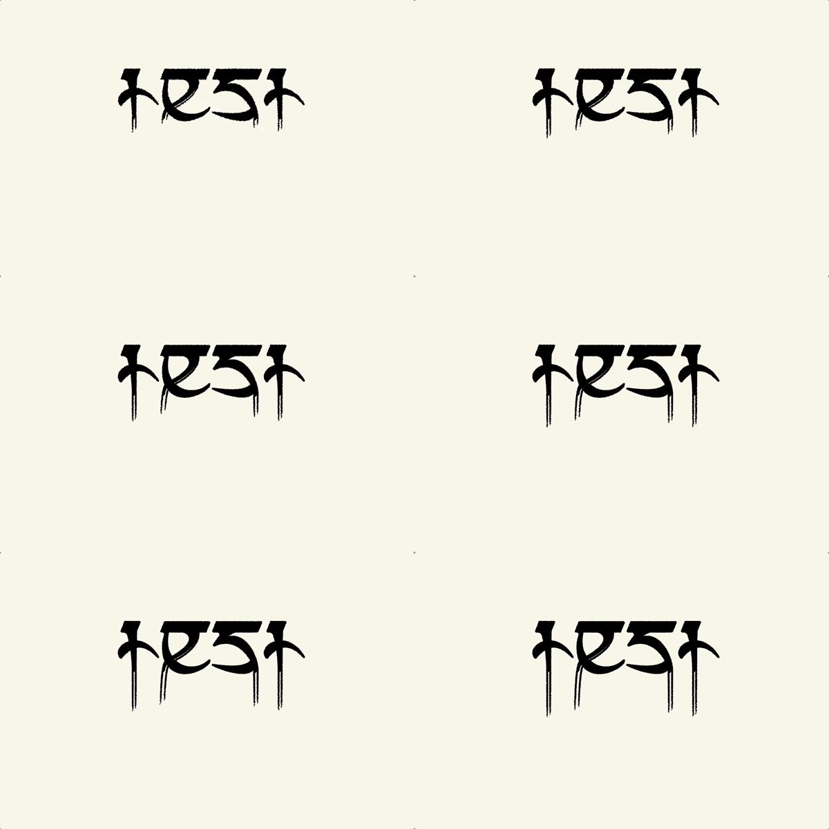
This was just the result of my trying to figure out a way to show my variable font drawn in p5js, rather than in the CSS. As my idea was to use text to point to create the ink on paper effect, then have the strokes slowly drip down, the only way to do so would be to 'fake' the variability. To achieve this effect, I had to draw one instance of my font in its maximum weight form, with text to points applied to it, then a background colour layer that moves down to reveal the long descenders, then draw the standard version of my font on the very top. At this point I started to think about other ideas, because I didn't really want to have put all the effort into my variable font if I wasn't going to use it in the sampler, so I started to think of other ideas.
Pinup session
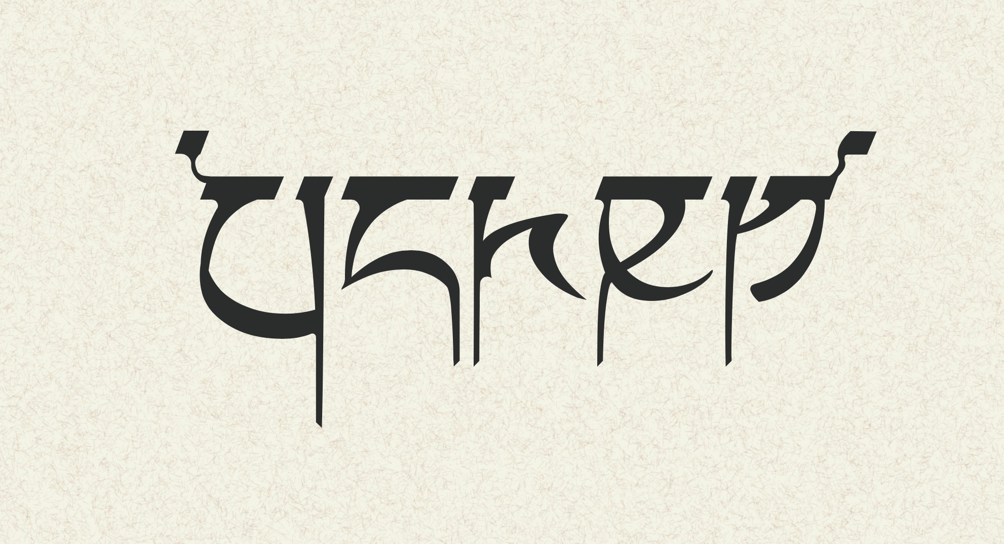
This was just the pinup that I showed in class in one of the last classes. I knew thhat my idea was going to change, but this was just the last step I had taken before the class. I got a lot of feedback that it looked very much like a sanskrit/ancient language style of font, but also a lot of feedback that it reminded people of a heavy metal band or band t-shirt. While I had noticed that when designing it, I hadn't thought that aspect of it would be so obvious to others, so from here I started thinking about a new idea that could incorporate that aspect and the traditional aspect in my sampler.
Getting a variable font into p5.js
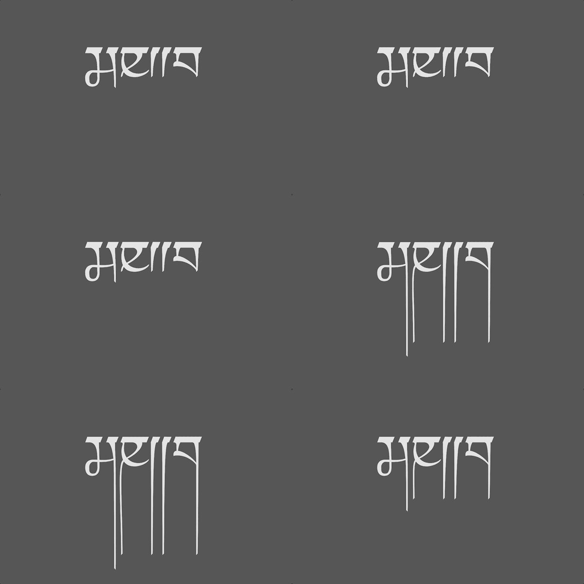
This is Karen's sketch of my font that is able to take the CSS set font and use it as the default font in a p5js sketch. In all my research I never found any way of doing it like this, so this development was super helpful. The only drawback for my situation was that being that the font is not loaded in the preload, p5js doesn't have access to the font's path information, so text to points cannot be applied. From here I changed the direction of my sampler to not use text to points at all.
Last steps
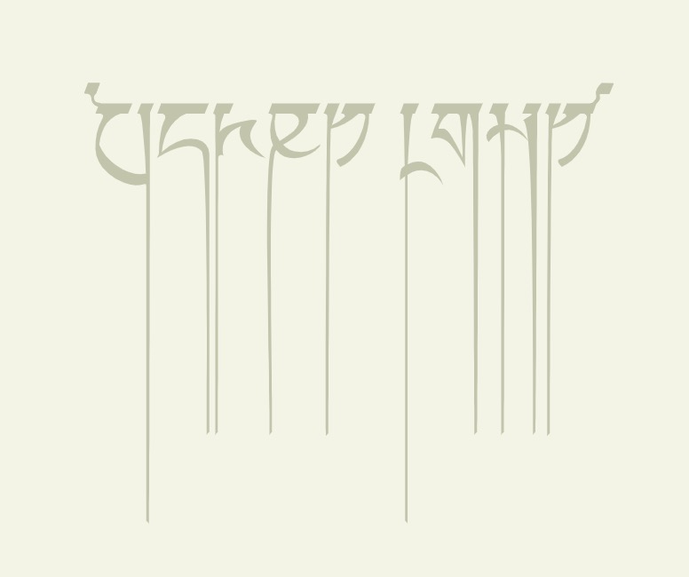
From here I basically just started building up my final sampler. It was a bit difficult in the beginning because I made the mistake of trying to turn my old sketch with the CSS into the new one with drawn text, so the code was messy and hard to keep track of. In line with my new direction relating the sampler to music in some way, I added some sound to control the variation of the font. I wanted the sampler to start out almost like my original idea, very calm and traditional, but then when someone is typing it becomes chaotic and loud. Before starting the 'trigger' I was mostly working on the change itself, and I did this using a lot of if/else statements. I'm sure there is definitely a neater way to do it though with the time I had left I want wanted to first get the sampler up and running.
Final sampler
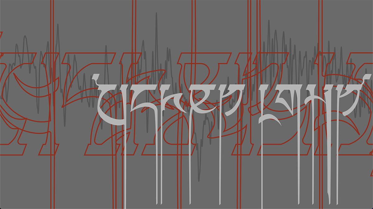
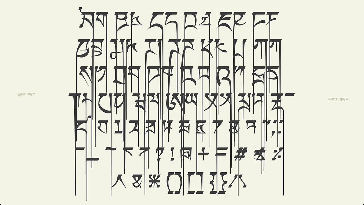
Then it was just a lot of tinkering with the code to get the usabilty right. I had trouble finding a way to implement my typing interaction in a way that was reliable. Karen gave me the idea of using the frame count of the sketch as a timer for the sound to stop after typing finishes, in turn stopping the visuals. After some playing around with it, it worked really well and did exactly what I wanted. After that I was pretty much done with the sketch, though as my sampler is a bit more on the abstract side, I wanted to have a way to see all the glyphs of the font and vary them as you please, so I just made a small 'sub-sampler' that has the full font view.
Full font view
Extra references
Variable font animation, Michelle Barker
Designing with variable fonts, variablefonts.io
CSS properties, W3 Schools