Affinity
brand redesign
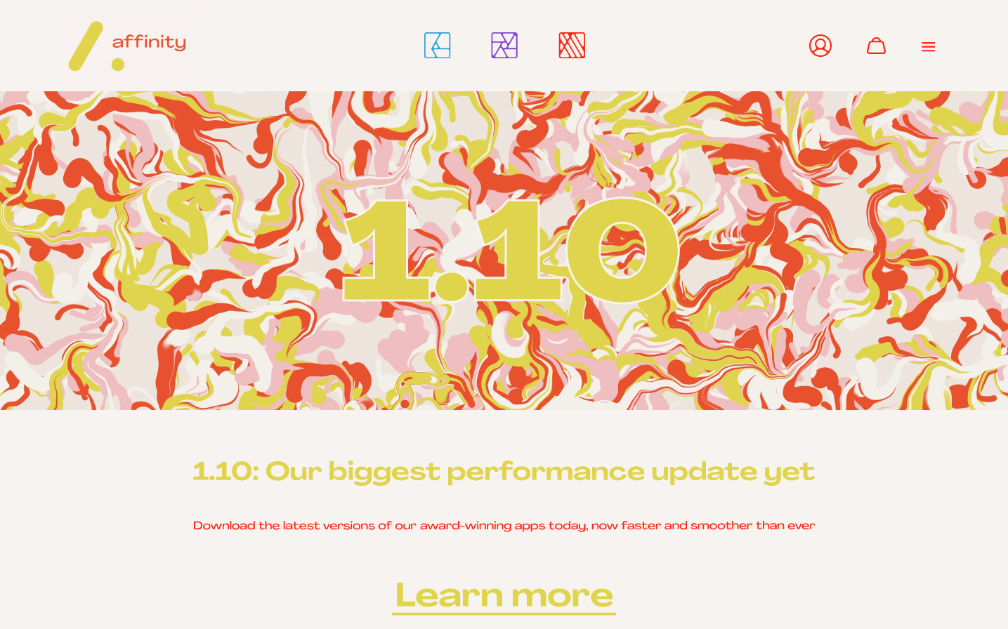
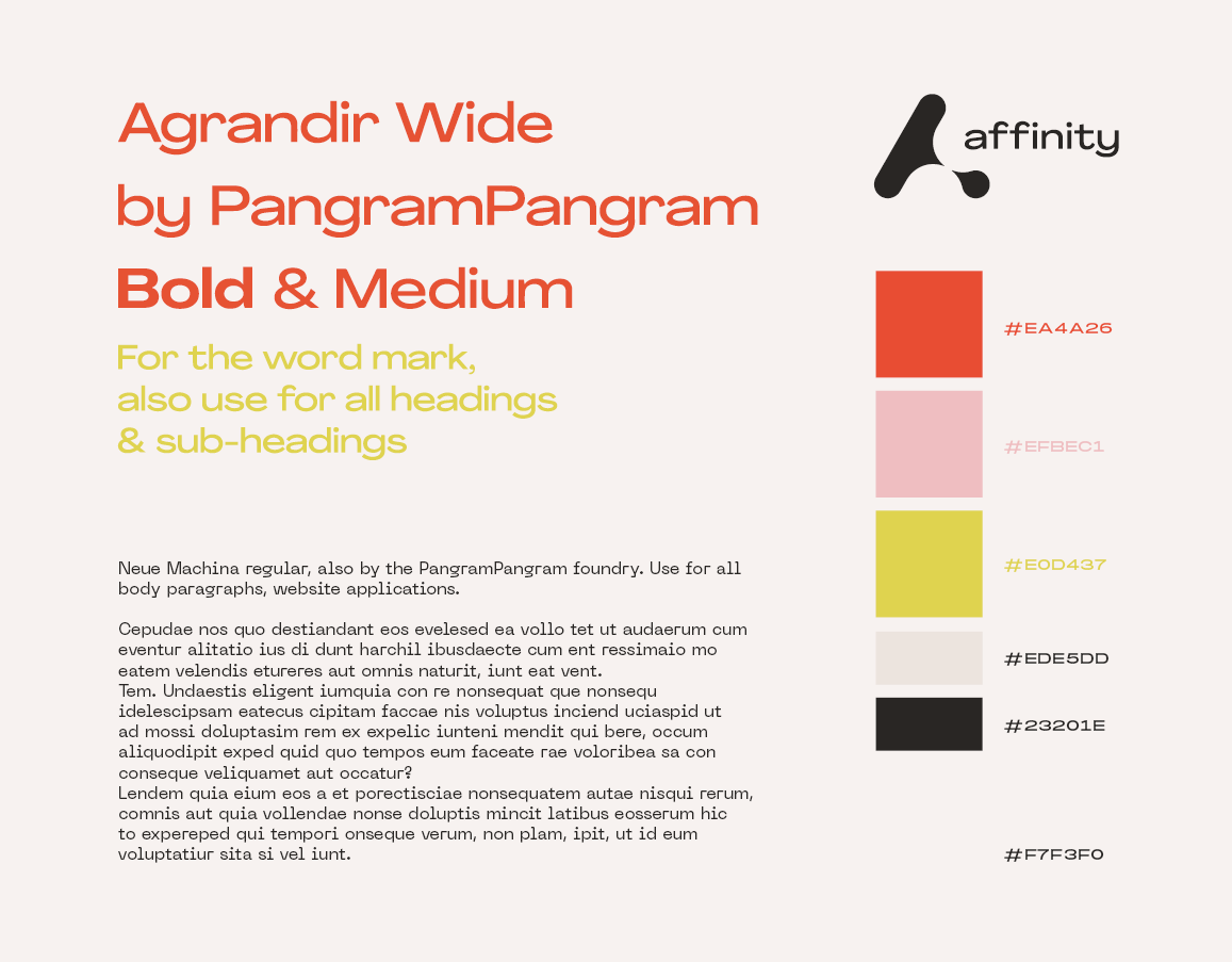
Affinity's logo and general visual brand was appearing somewhat dated and disconnected with the creative roots of the brand. My goal was to reimagine how Affinity could present itself as a more friendly, welcoming, creatively-focused software company, with the visual strength to rival the bigger players in the industry. The brief was to create a new logo that retains the triangular form of the original logo, new app icons for desktop and mobile applications, accompanied by new typography and a comprehensive colour system to use throughout the brand's digital platforms and collateral.
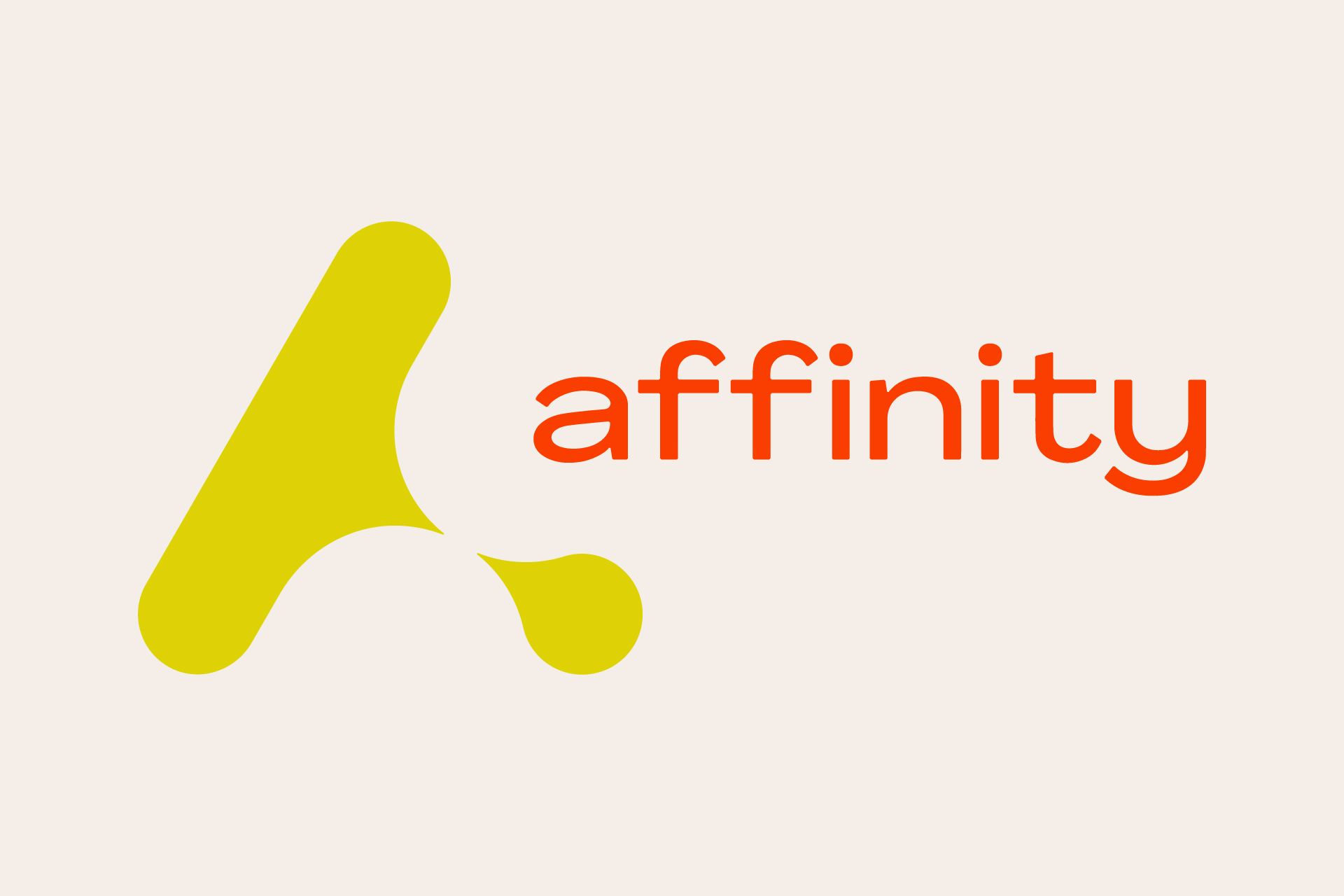
logo and wordmark variations
app icons for tablet and desktop
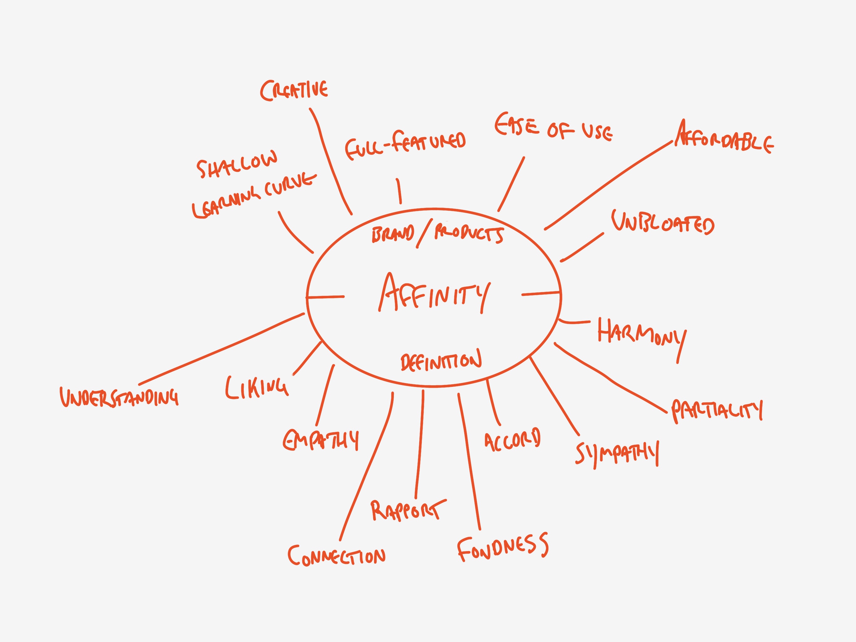
initial mind-mapping
logo options
From the beginning of the design process, the goal was to represent the brand and products that Affinity offer, while at the same time embodying the definition of the word 'Affinity' itself. Each of the logo options below represent Affinity in a different way. Ultimately the animated logo was chosen which represents the concept of Affinity as a smaller body merging with the larger body, becoming whole. It maintains the triangle form of the original logo, and expands on it with a more friendly, approachable image.
