Li-Ning
brand and art direction
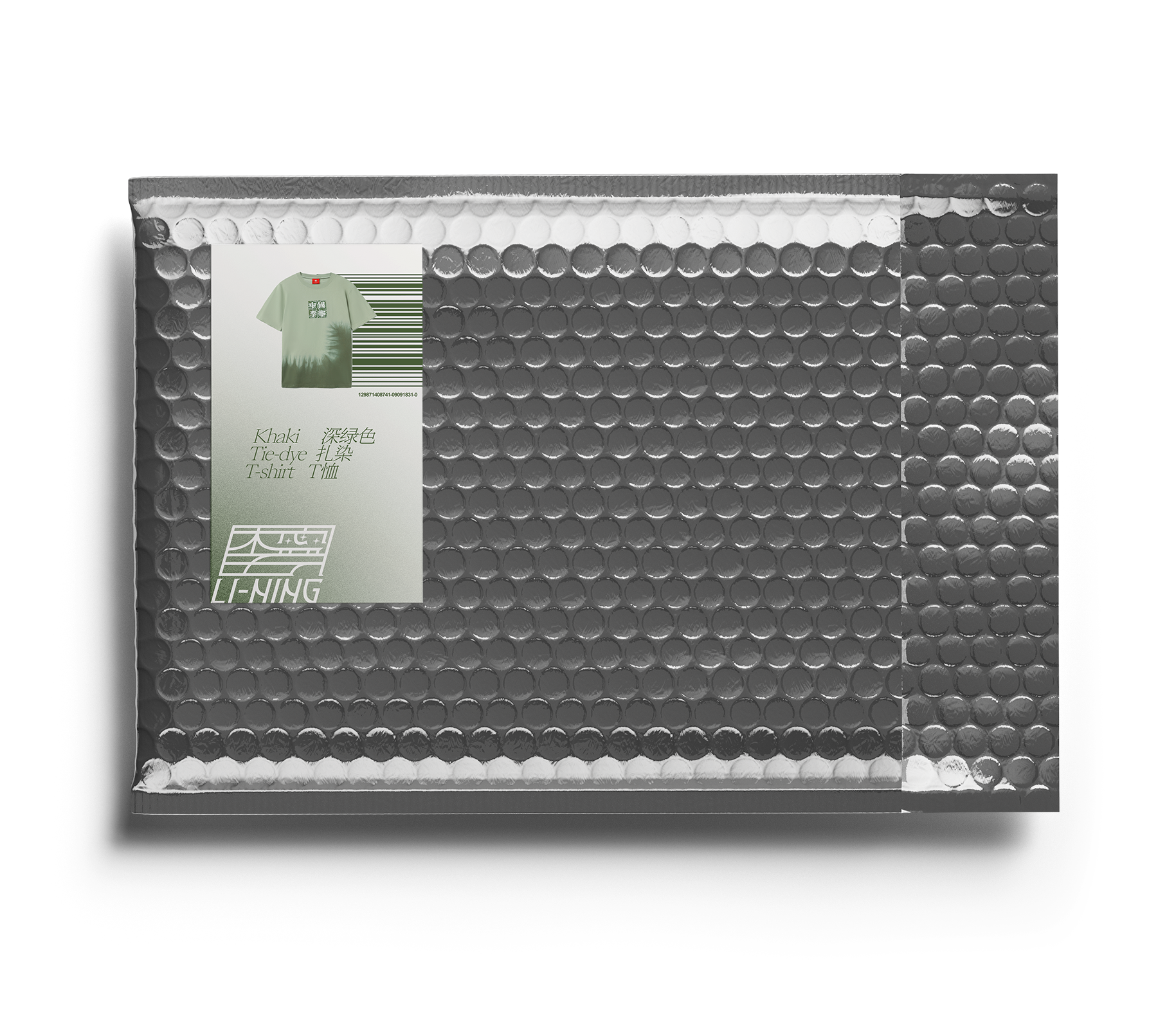
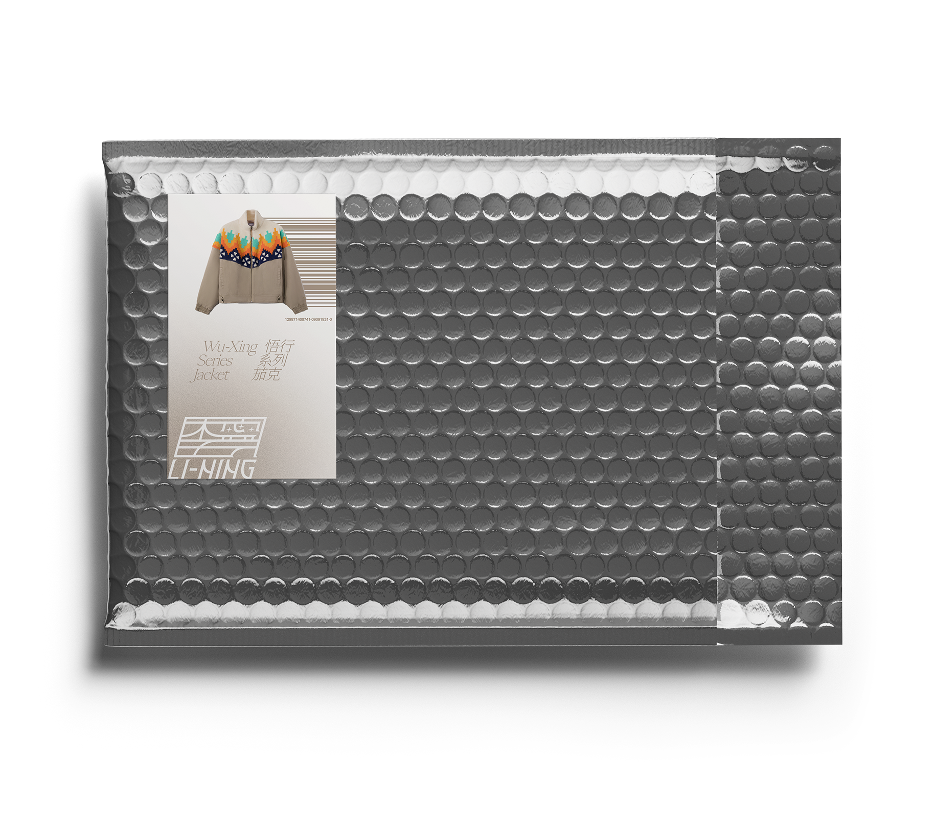
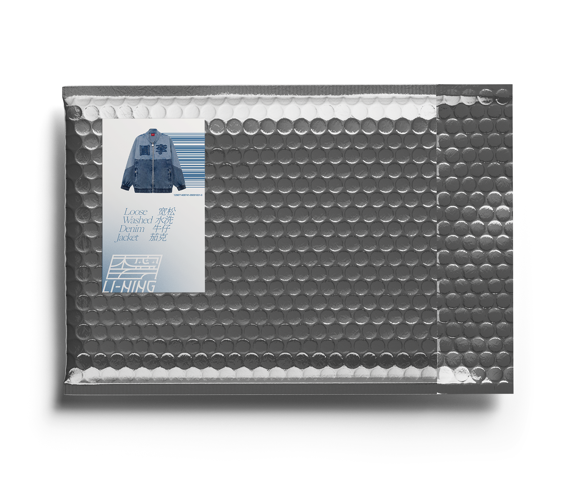
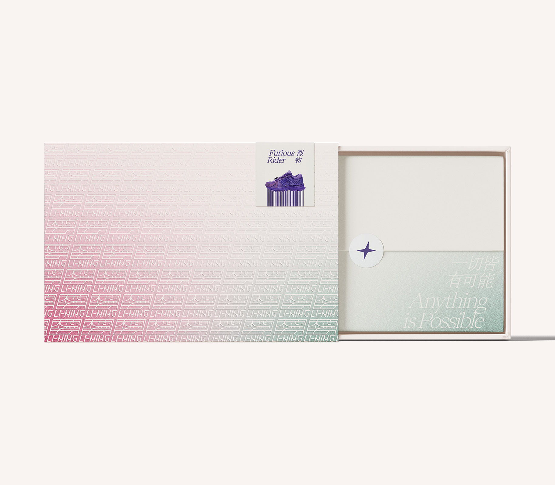
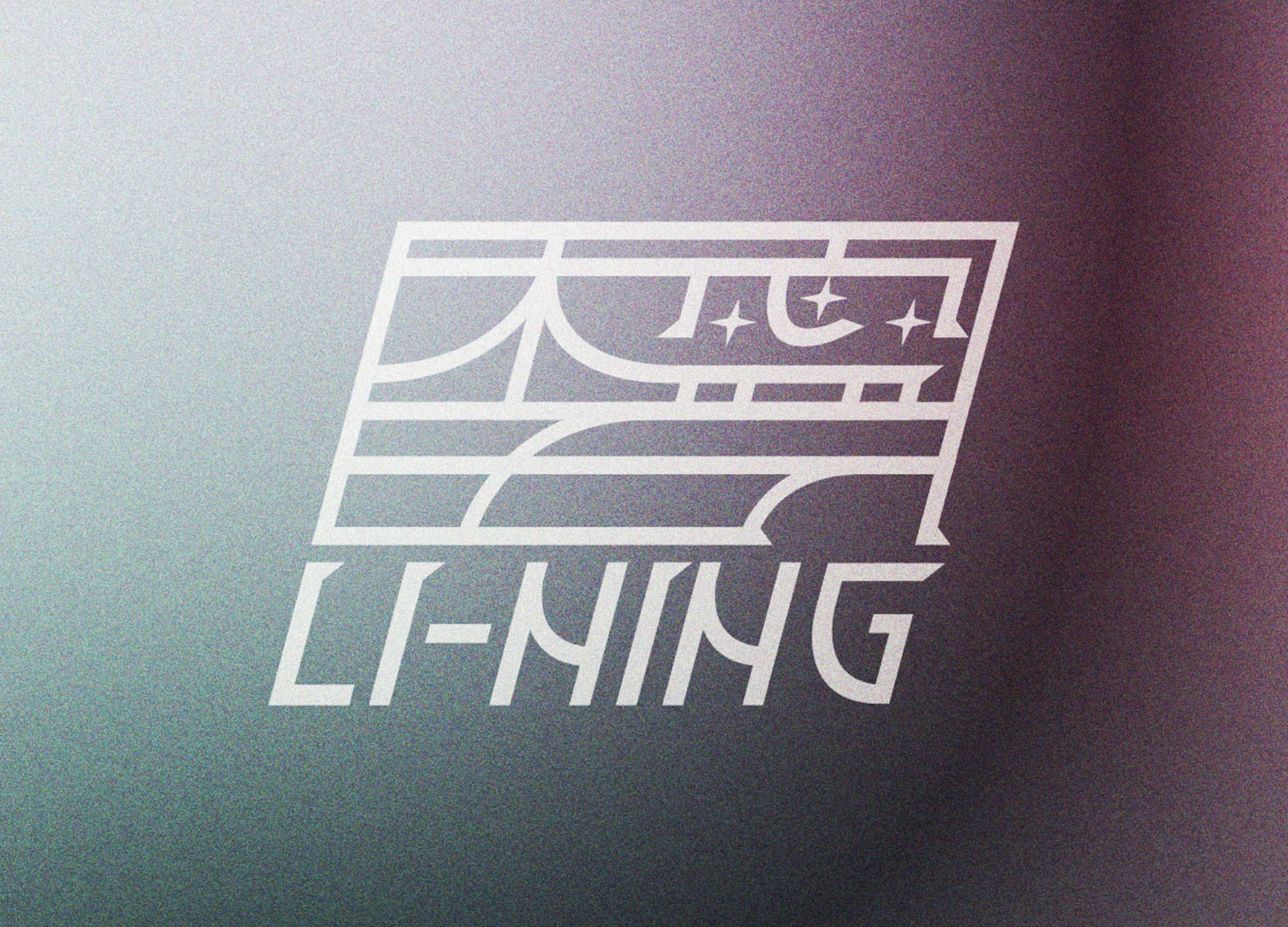
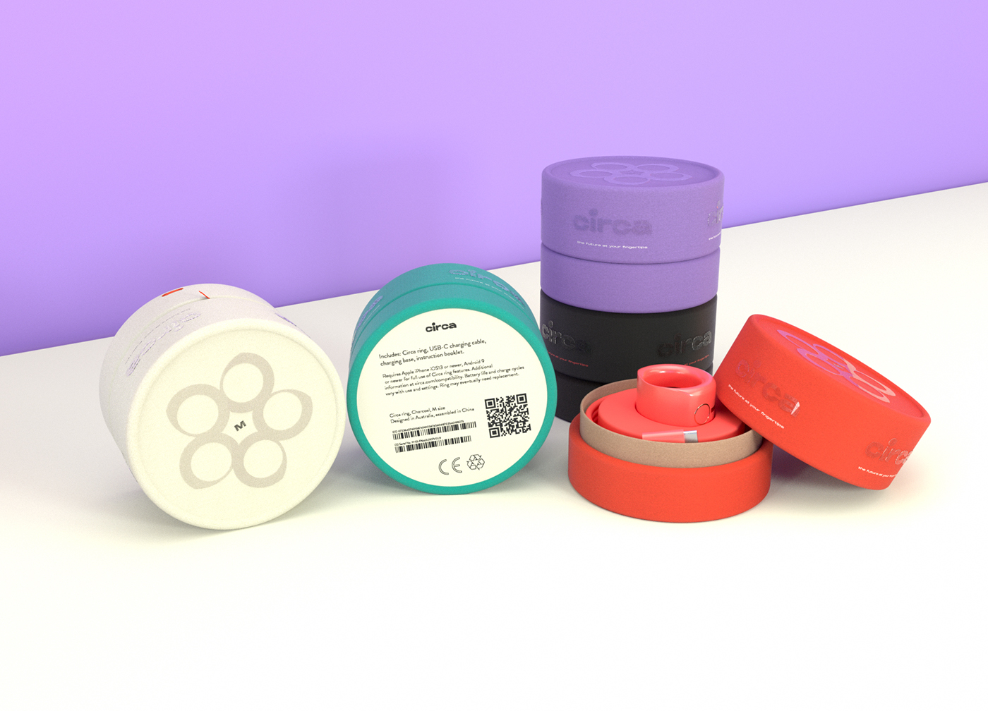
The goal of the reimagination of the the ‘China Li-Ning’ brand’s art direction was to make it unified across all media environments and international markets, as well as bring it into the future with the brand’s future market sector and target market in mind. The visual language that I wanted to link to the art direction was one that was progressive, yet adaptable across many applications. The social media posts are each advertising a new footwear product, with the names of each product featuring in the posts, and determining the actual concept of the posts. For example, the first post is for the ‘Xuan Kong’ shoe, which in Chinese means ‘hanging in air’, so the animation shows the shoe and text are floating up. The other post is for the ‘Wu Xing’ shoe, which in Chinese is a homonym for ‘5 stars’, so I presented the shoe in a 5-point star formation with the name appearing in the centre. The site concept and packaging shows the art direction and rebrand on another level, with interactivity on the website and a more physical example in the packaging examples.
